Button widgets, like label widgets, display some noneditable visual such as text or a pixmap. Unlike label widgets, button widgets can be activated by a user. When a user activates a button widget, an application callback is typically triggered.
This chapter explains how to write a Motif button widget. It begins by examining the kinds of buttons we expect you to write, and the kinds of buttons we recommend that you not write. Then, this chapter examines the following three button demonstration widgets:
The ExmCommandButton widget acts as a button in a DialogBox.
The ExmMenuButton widget acts as a menu button. It can be the child of any XmRowColumn widget whose XmNrowColumnType is set to some value other than XmWORK_AREA.
The ExmTabButton widget is meant to serve as a tab child of an XmNotebook widget.
The standard Motif widget set includes several different kinds of button widgets. Since writing a button widget is not a simple task, you should first determine if one of the standard button widgets already does what you need. For example, if you need a button widget to display interesting visuals, you should consider using the XmDrawnButton widget rather than writing your own widget.
XmPushButton can serve as a DialogBox button widget. However, you may want to write your own DialogBox button widget if you require features not available in XmPushButton. For example, you will need to write your own widget if you want a DialogBox button widget that has a nonrectangular shape. When a button widget becomes the default choice of a DialogBox, the button widget needs to visually alter itself. If you do not like the way that XmPushButton visually alters itself, you can write your own DialogBox button widget.
None of the standard Motif button widgets install the XmQTjoinSide trait. So, if you want a button widget that knows how to visually merge itself with its manager, you are going to have to write your own.
If you do decide to write your own menu button widget, we do not recommend writing it "from scratch." Rather, we strongly recommend that you do it by modifying the ExmMenuButton widget. Note, however, that OSF does not support the ExmMenuButton widget in any way.
Menu button widgets must be managed by a widget holding the XmQTmenuSystem trait. The only standard Motif widget that holds this trait is XmRowColumn. Do not write your own XmQTmenuSystem widget; always use the XmRowColumn widget that comes with the Motif toolkit.
We strongly caution you against writing your own CascadeButton-style widget. If you need a CascadeButton, use the XmCascadeButton widget that comes with the Motif toolkit.
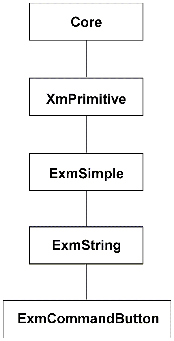
The ExmCommandButton widget demonstrates how to code a button widget for a DialogBox. As Figure 11-1 shows, ExmCommandButton is a subclass of ExmString. ExmCommandButton therefore inherits ExmString's ability to display a compound string. ExmCommandButton layers on the additional ability to function as an activatable button inside a DialogBox, much the way an XmPushButton is used as an OK button inside a standard selection box.
In the following subsections, we examine a few features of the ExmCommandButton.
Every DialogBox button widget must be activatable. In other words, when the user explicitly or implicitly chooses your button, your button must call the appropriate activate callbacks. The ExmCommandButton widget does the following in order to become activatable:
Provides an activate callback.
Installs the XmQTactivatable trait on the widget
ExmCommandButton provides an activate callback resource named XmNactivateCallback. The XmNactivateCallback resource is defined in the resources array of CommandB.c as follows:
{
  XmNactivateCallback,
  XmCCallback,
  XmRCallback,
  sizeof(XtCallbackList),
  XtOffsetOf( ExmCommandButtonRec, command_button.activate_callback),
  XmRPointer,
  (XtPointer) NULL
}, |
When an ExmCommandButton is activated, it must initialize a callback structure and then call XtCallCallbackList. Both of these things are done in several different action methods of ExmCommandButton. For example, following is the ExmCommandButtonActivate action method:
ExmCommandButtonActivate (
        Widget w,
        XEvent *event,
        String *params,
        Cardinal *num_params
)
{
 ExmCommandButtonWidget cw = (ExmCommandButtonWidget)w;
 XmAnyCallbackStruct cb;

  if (cw->command_button.activate_callback) {
 /* Initialize a callback structure. */
     cb.reason = XmCR_ACTIVATE;
     cb.event = event;
     XFlush (XtDisplay(cw));
 /* Call XtCallCallbackList. */
     XtCallCallbackList (w, cw->command_button.activate_callback, &cb);
  }
} |
The XmNactivateCallback resource of ExmCommandButton uses the generic callback structure XmAnyCallbackStruct. Your own DialogBox button widget may define a more elaborate activation callback structure.
The XmQTactivatable trait tells a DialogBox that the ExmCommandButton widget wishes to be treated as a DialogBox button. In other words, Motif DialogBox widgets check their children for this trait. Only those children holding this trait are eligible to become DialogBox buttons.
The XmQTactivatable trait defines a trait method called changeCB. A DialogBox calls this trait method to add or remove a callback from the list of activate callbacks held by the DialogBox button widget.
The following shows how ExmCommandButton codes the changeCB trait method:
ChangeCB(
         Widget widget,
         XtCallbackProc activCB,
         XtPointer clientData,
         Boolean setUnset)
{
  if (setUnset)
    XtAddCallback (widget, XmNactivateCallback, activCB, clientData);
  else
    XtRemoveCallback (widget, XmNactivateCallback, activCB, clientData);
} |
The Motif Style Guide mandates that a DialogBox widget have a default action associated with it at all times. For example, consider an XmSelectionBox having three DialogBox buttons: an OK button, a Cancel button, and an Apply button. Of these three buttons, suppose the OK button is the current default button. When the user activates the default action (typically by pressing Return anywhere in the DialogBox), the DialogBox must act as if the OK button was explicitly pushed.
The default button must provide some visual cue so that users will know that it is, in fact, the default button. Typically, the default button does this by displaying a border around itself; however, the widget writer is somewhat free to pick a different kind of visual cue. (See the Motif Style Guide for the exact constraints regarding this visual cue.)
To support default activation, Motif provides the XmQTtakesDefault trait.All dialog buttons must install this trait. This trait announces to DialogBox widgets that the dialog button is capable of changing its appearance to show that it is the default button.
The XmQTtakesDefault trait provides only one trait method, showAsDefault. The DialogBox managing the button will typically call this trait method one or more times, each time asking the button to get into a different state. The DialogBox will probably ask each of its buttons to get into the XmDEFAULT_READY state first. Each ExmCommandButton responds to this by expanding its margins. The DialogBox widget will then ask one of its buttons to become the default button by asking it to go into the XmDEFAULT_ON state. ExmCommandButton responds to this state by displaying distinctive highlighting. If a different button becomes the default button, the DialogBox widget asks the former default button to go into the XmDEFAULT_OFF state.ExmCommandButton responds to this request by removing its distinctive highlighting.What follows is the implementation of the showAsDefault trait method of ExmCommandButton:
ShowAsDefault(Widget w,
              XtEnum state)
{
 ExmCommandButtonWidgetClass cbwc = (ExmCommandButtonWidgetClass)XtClass(w);
 ExmCommandButtonWidget cbw = (ExmCommandButtonWidget)w;
 Position   start_x_of_outer_shadow,  start_y_of_outer_shadow;
 Dimension  margin_push_out;
 Dimension  width_of_outer_shadow, height_of_outer_shadow;
 int   dx, dy, width, height;
 GC    top_GC, bottom_GC;
 Dimension outer_shadow_thickness;
 int       outer_shadow_type;
 int       margins_were_pushed_out=0;
#define MARGIN_BETWEEN_HIGHLIGHT_AND_OUTER_SHADOW 2

  start_x_of_outer_shadow = cbw->primitive.highlight_thickness +
                            MARGIN_BETWEEN_HIGHLIGHT_AND_OUTER_SHADOW;
  start_y_of_outer_shadow = cbw->primitive.highlight_thickness +
                            MARGIN_BETWEEN_HIGHLIGHT_AND_OUTER_SHADOW;
  width_of_outer_shadow  = cbw->core.width - (2 * start_x_of_outer_shadow);
  height_of_outer_shadow = cbw->core.height - (2 * start_y_of_outer_shadow);
  outer_shadow_thickness = 3;

   switch (state) {
     case XmDEFAULT_READY:
       /* Push out the margins to make room for subsequent increases in
          the shadow thickness. The request to push out the margins will
          increase the size of the CommandButton widget assuming that its
          manager has the space to spare. */

          if (cbw->primitive.shadow_thickness < 5)
            margin_push_out = 5;
          else
            margin_push_out = cbw->primitive.shadow_thickness;
          margins_were_pushed_out = 1;
          XtVaSetValues((Widget)cbw,
             XmNmarginWidth,  cbw->simple.margin_width + margin_push_out,
             XmNmarginHeight, cbw->simple.margin_height + margin_push_out,
             NULL);
          break;
     case XmDEFAULT_ON:
       /* Draw an outer shadow. The outer shadow is drawn outside the
          widget's margins but inside the border highlight.
          The inner shadow is drawn by the DrawShadow method. */
          top_GC = cbw->primitive.top_shadow_GC;
          bottom_GC = cbw->primitive.bottom_shadow_GC;
          outer_shadow_type = cbw->command_button.visual_armed ?
                                         XmSHADOW_ETCHED_IN:
                                         XmSHADOW_ETCHED_OUT;
          XmeDrawShadows(XtDisplay(w), XtWindow(w),
                         top_GC,
                         bottom_GC,
                         start_x_of_outer_shadow,
                         start_y_of_outer_shadow,
                         width_of_outer_shadow,
                         height_of_outer_shadow,
                         outer_shadow_thickness,
                         outer_shadow_type);
          break;
     case XmDEFAULT_OFF:
       /* Erase the outer shadow when the widget is no longer the
          default. */
          XmeClearBorder(XtDisplay(w), XtWindow(w),
                         start_x_of_outer_shadow,
                         start_y_of_outer_shadow,
                         width_of_outer_shadow,
                         height_of_outer_shadow,
                         outer_shadow_thickness);
          break;
     case XmDEFAULT_FORGET:
     default:
       /* The widget is not a potential default button. If XmDEFAULT_FORGET
          is called at some point after XmDEFAULT_READY was called, then
          we have to restore the margins back to their original size. */
          if (margins_were_pushed_out)
            XtVaSetValues((Widget)cbw,
              XmNmarginWidth,  cbw->simple.margin_width - margin_push_out,
              XmNmarginHeight, cbw->simple.margin_height - margin_push_out,
              NULL);
          break;
    }
} |
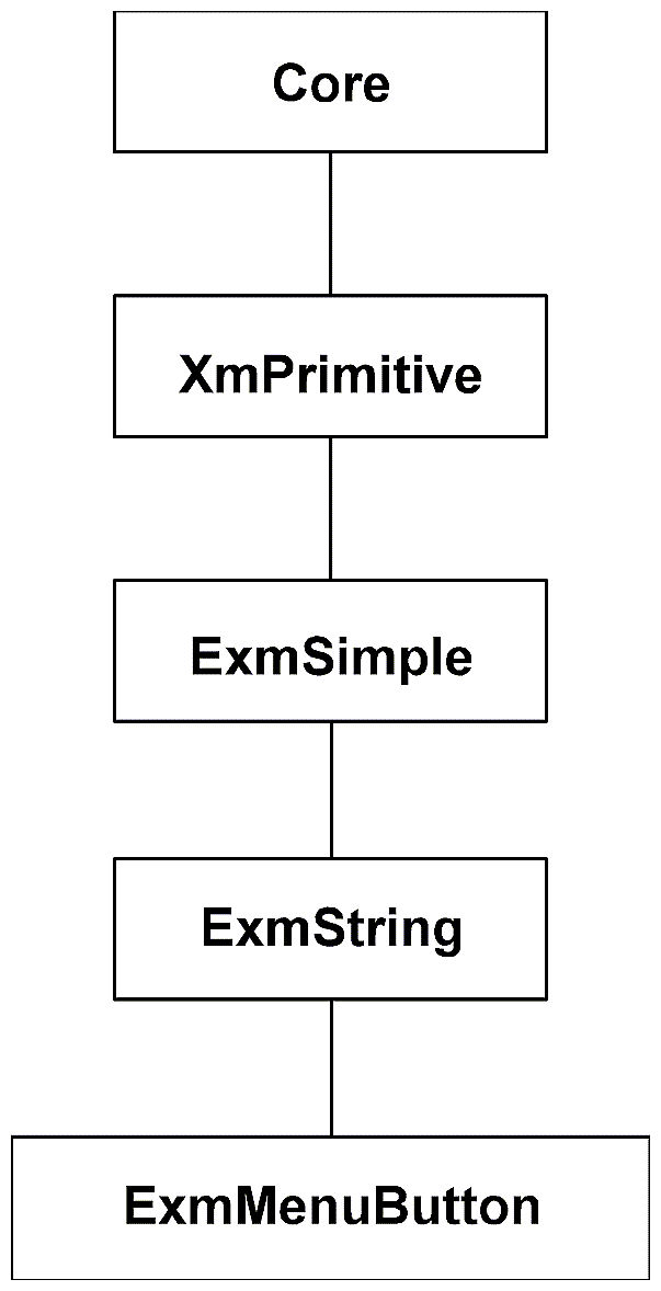
The ExmMenuButton demonstration widget is a subclass of ExmString. Figure 11-2 shows its position in the hierarchy.
Like an ExmString, an ExmMenuButton can display one compound string. However, ExmMenuButton provides the additional ability to function as a menu child widget. That is, an ExmMenuButton can be a child of an XmRowColumn whose XmNrowColumnType resource is set to something other than XmWORK_AREA.
Before getting too deeply into menu buttons, we want to remind you that you should not write an original menu button widget. If you feel the standard Motif menu button widgets and gadgets do not meet your needs, then you should modify ExmMenuButton. For example, you might provide a realize method for ExmMenuButton that creates circular-shaped menu buttons. Another possibility is to extend the visuals of ExmMenuButton so that each menu button simultaneously displays both a pixmap and some text.
The following subsections detail selected features of ExmMenuButton.
ExmMenuButton provides two different translation strings: defaultTranslations and traversalTranslations.
The defaultTranslations string is specified in the tm_table field of the Core class record. These translations handle activation events.
The traversalTranslations string is used in the translations field of the Primitive class record. These translations allow a user to move between menu choices. None of the action routines associated with the traversalTranslations string are defined by the ExmMenuButton widget. Therefore, the Intrinsics automatically search for the action routines in the parent of ExmMenuButton. The only possible parent of an ExmMenuButton widget is an XmRowColumn widget. As it happens, XmRowColumn defines all the MenuTraverse action routines.
Every menu button widget must install the XmQTmenuSavvy trait. The menu system widget (XmRowColumn) examines its children for this trait. If a child does not hold this trait, the child cannot be a child of the Motif menu system widget.
ExmMenuButton installs the XmQTmenuSavvy trait as part of its ClassInitialize method. The following call to XmeTraitSet does the installation:
XmeTraitSet(exmMenuButtonWidgetClass, XmQTmenuSavvy,
(XtPointer) &menuSavvyTraitRec); |
The third argument to XmeTraitSet, menuSavvyTraitRec, is defined earlier in the MenuB.c file as follows:
static XmConst XmMenuSavvyTraitRec menuSavvyTraitRec = {
  0,                                        /* Version */
  (XmMenuSavvyDisableProc) DisableCallback, /* disableCallback   */
  GetAccelerator,                           /* getAccelerator    */
  GetMnemonic,                              /* getMnemonic       */
  GetActivateCBName,                     /* getActivateCBName */
}; |
The ExmMenuButton widget supports accelerators and mnemonics. (See the Motif Programmer's Guide for details on accelerators and mnemonics.) In brief, mnemonics and accelerators each provide a way for a user to activate a menu button without actually clicking on it. For example, the AllExmDemo.c demonstration program places both an accelerator and a mnemonic on the ExmMenuButton Quit button. The accelerator is "Alt-q". Therefore, a user can activate the ExmMenuButton Quit button by pressing Alt-q even when the button is not visible. The mnemonic is "Q". Therefore, a user can activate the ExmMenuButton Quit button by pressing Q whenever the button is visible.
To support accelerators and mnemonics, ExmMenuButton does the following:
Provides appropriate resources; manages the resource values in initialize and set_values
Provides appropriate XmQTmenuSavvy trait methods
Provides appropriate visual support for accelerators and mnemonics in its DrawVisual method
The following subsections examine each of the preceding items.
ExmMenuButton provides the following resources definitions in its resources array to support accelerators and mnemonics:
...
{
    XmNmnemonic,
    XmCMnemonic,
    XmRKeySym,
    sizeof(KeySym),
    XtOffsetOf( ExmMenuButtonRec, menu_button.mnemonic),
    XmRImmediate,
    (XtPointer) XK_VoidSymbol
},

{
    XmNaccelerator,
    XmCAccelerator,
    XmRString,
    sizeof(char *),
    XtOffsetOf(ExmMenuButtonRec, menu_button.accelerator),
    XmRImmediate,
    (XtPointer) NULL
},

{
    XmNacceleratorText,
    XmCAcceleratorText,
    XmRXmString,
    sizeof(XmString),
    XtOffsetOf(ExmMenuButtonRec, menu_button.accelerator_text),
    XmRImmediate,
    (XtPointer) NULL
},

{
    XmNmnemonicCharSet,
    XmCMnemonicCharSet,
    XmRString,
    sizeof(XmStringCharSet),
    XtOffsetOf(ExmMenuButtonRec, menu_button.mnemonic_charset),
    XmRImmediate,
    (XtPointer) XmFONTLIST_DEFAULT_TAG
}
... |
The XmQTmenuSavvy trait contains two relevant trait methods: getAccelerator and getMnemonic. What follows is how ExmMenuButton implements these two trait methods:
static char*
GetAccelerator(Widget w)
{
  ExmMenuButtonWidget mw = (ExmMenuButtonWidget)w;

  return(mw -> menu_button.accelerator);
}


static KeySym
GetMnemonic(Widget w)
{
  ExmMenuButtonWidget mw = (ExmMenuButtonWidget)w;

  return(mw -> menu_button.mnemonic);
} |
The menu system widget (XmRowColumn) calls these two trait methods to determine what the accelerator and mnemonic are.
ExmMenuButton must provide visuals that tell the user what the accelerator and mnemonic are. The visuals are rendered by the DrawVisual method of ExmMenuButton.
It is customary to identify the mnemonic by underlining one of the characters in the regular button text. The DrawVisual method of ExmMenuButton calls XmStringDrawUnderline to do the underlining.
If a button has an accelerator, the accelerator must be shown following the label of the button. After DrawVisual draws the regular button text, DrawVisual calls XmStringDraw to write the accelerator text.
ExmMenuButton does not install the XmQTmenuSystem trait. Rather, XmRowColumn installs this trait, and ExmMenuButton calls many of its trait methods. We now consider several of those calls to XmQTmenuSystem trait methods.
When the cursor enters the window associated with an ExmMenuButton, the ExmMenuButton method is called. This method is responsible for giving focus to the ExmMenuButton, but only if the menu system is in drag mode. (When the menu system is in drag mode, each menu button child will automatically be highlighted as it gains keyboard focus.)
In order to do this, the MenuButtonEnter method must ask its parent if it holds the XmQTmenuSystem trait. The following code illustrates this:
{
ExmMenuButtonWidgetClass wc = (ExmMenuButtonWidgetClass)XtClass(w);
ExmMenuButtonWidget mw = (ExmMenuButtonWidget)w;
XmMenuSystemTrait menuSTrait;
int status;

menuSTrait = (XmMenuSystemTrait)
  XmeTraitGet((XtPointer) XtClass(XtParent(w)), XmQTmenuSystem);

if (! menuSTrait)
return; |
Assuming that the parent is a menu system widget, the MenuButtonEnter method must now find out what state the widget is in. To do so, the MenuButtonEnter method must call the status trait method as follows:
status = menuSTrait->status(w); |
The status trait method returns a bit mask into the status variable. The Xm/MenuT.h header file provides several macros for probing the returned bit mask. The MenuButtonEnter method calls the XmIsInDragMode macro to determine if the menu system is in drag mode as follows:
if ((((ShellWidget) XtParent(XtParent(mw)))->shell.popped_up) &&
XmIsInDragMode(status)) { |
If the menu system is in drag mode, then the ExmMenuButton must grab the keyboard focus by calling the childFocus trait method of XmQTmenuSystem as follows:
menuSTrait -> childFocus(w); |
An application program can attach one or more tab children to an XmNotebook widget. In most applications, the tab children are usually XmLabel widgets, but nothing prevents widget writers from creating their own tab children widgets. The ExmTabButton demonstration widget is one possible tab child widget.
All tab children widgets should install the XmQTjoinSide trait. Widgets holding this trait can affix themselves directly onto the side of another widget. Widgets with this trait look almost as if they have been melded onto the side of another widget. This appearance is especially useful for tab buttons, so the ExmTabButton widget installs the XmQTjoinSide trait.
Widgets holding the XmQTjoinSide trait usually have a somewhat irregular shape. This irregular shape makes it much harder for a widget writer to draw suitable window decorations (border highlights and shadows). In other words, since the window is not a standard rectangular shape, the border highlights and shadows cannot be rectangular either. See the BorderHighlight, BorderUnhighlight, and DrawShadows routines of ExmTabButton for details.