This chapter presents detailed information about components, user interface models, and concepts in reference format. Each topic starts on a new page and is organized alphabetically. Details on user interface models and concepts are provided in the earlier chapters of this guide. The model and concepts reference pages are provided here only as a quick reference to information provided earlier and are not complete in every detail. Therefore, they should not be used as the definitive source for information about user interface models and concepts. This chapter includes the following model and concepts reference pages:
Accelerators | Focus | Navigation |
Activation | Framing Groups | Pointer Shapes |
Basic Controls | Help Menu | Popup Menus |
Basic Groups | Icon Menu | Primary Selection |
Default Activation | IconBox | Quick Transfer |
Drag and Drop | Icons | Selection |
Edit Menu | Input Devices | Window Menu |
Field Controls | Layout Groups |
|
File Menu | Mnemonics |
|
The reference pages for components are provided for designers to use when implementing the components described in this guide or when creating new components. Remember, when designing new components, you should follow the same rules that application designers follow. As such, you should be familiar with all the chapters of this guide, not just this reference-page section. New components must follow the guidelines for designing applications. This chapter contains the following control and group reference pages:
Canvas | List | Scale |
CascadeButton | MainWindow | ScrollBar |
CheckButton | MenuBar | ScrolledWindow |
CommandBox | Menus | SelectionBox |
CommandDialog | MessageDialog | SelectionDialog |
Composition | OptionButton | Separator |
DialogBox | PanedWindow | TearOffButton |
ErrorDialog | Panel | ToggleButton |
FileSelectionBox | PromptDialog | WarningDialog |
FileSelectionDialog | PushButton | WorkingDialog |
Frame | QuestionDialog | Label |
InformationDialog | RadioButton |
|
When designing a new component, compare its features with those of other components. If the new component has a feature that is the same as another component, the mechanisms for using the feature, layout, key bindings, graphics, and so on, must be similar to the existing component.
Each component reference page may contain the following information about the component:
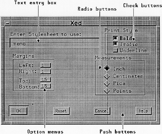
| Description | A description of the use and appearance of each component, group, or model. | |
| Illustration | An illustration of a typical component. The illustrations in this guide use the OSF/Motif reference appearance with 3-dimensional beveled edges. Although it is important to be consistent in the placement of the elements in a component, the appearance, or rendering, of the component is not an issue of OSF/Motif Style Guide compliance. | |
| Navigation | A description of the methods for navigating within a component. | |
| Other Operations | | |
| Common Bindings | | |
| Related Information | |
An accelerator is a key or key combination that invokes the action of some component without the location cursor being on the component when the accelerator is pressed. Accelerators are most commonly used to activate Menu items without first posting the Menu. You should provide accelerators primarily as a matter of utility, not for design conformity.
If the button with the accelerator is within a primary or secondary window, or within a Pulldown Menu system from its MenuBar, it must be activatable whenever the input focus is in the window or the MenuBar system. If the button with the accelerator is within a Popup Menu system, it must be activatable whenever the focus is in the Popup Menu system or the component with the Popup Menu.
Applications can provide accelerators for any button component. Implementations must support accelerators in PushButtons and ToggleButtons that are in Menus. If a button has an accelerator, the accelerator must be shown following the label of the button.
This reference page only provides a short description of the various types of activation. Chapter 5, "Component Activation" describes each type in detail.
| Basic Activation |
| |
| Accelerators |
| |
| Mnemonics | A mnemonic is a single character that can be associated with any component that contains a text label. When the location cursor is on a component within a Menu, a MenuBar, or the same field as a component with a mnemonic, typing the mnemonic character must move the location cursor to the component and activate it. If a mnemonic is used for an OptionButton, for a CascadeButton in a MenuBar, or a PushButton that is not in a basic group (that is, not in a Panel, a Menu, or a MenuBar), pressing <Alt> and the mnemonic anywhere in the window or its Menus must move the cursor to the component with that mnemonic and must activate it. | |
| TearOff Activation |
| |
| Help Activation |
| |
| Popup Menu Activation |
| |
| Default Activation |
| |
| Expert Activation |
| |
| Cancel Activation |
|
See Chapter 5, "Component Activation" for more information about the activation model.
Basic controls are components that only take simple input. They are distinct from field controls in that they are usually elements of navigation fields rather than fields themselves. Basic controls must have no internal navigation. The following text describes the basic controls:
A single-line Text control can be configured to act like a basic control.
Activatable basic controls follow the basic activation model described in Section 5.1, "Basic Activation."
Basic groups of controls are used to organize groups of basic controls. The following text describes the basic groups:
The <Down arrow>,<Left arrow>,<Right arrow>,and <Up arrow> direction keys must navigate within a basic group according to the navigation model described in Chapter 3, "Navigation."
A CascadeButton should be used to post a Pulldown Menu. This component must be composed of a button, with either a text or graphics Label. Following the Label, this component should also include an arrow graphic, pointing in the direction that the Menu will be posted to distinguish it from a PushButton. The graphic is usually not shown in a MenuBar.
CascadeButtons follow the Menu activation model described in Section 3.3, "Menu Traversal." The following text describes the other operations of this component:
| <Help> | Must provide any available help for the CascadeButton. |
For more information, see the reference pages in Section 9.34, "Menus."
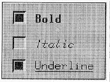
A CheckButton should be used to set options in the application. A CheckButton is a special case of a ToggleButton. Any number of CheckButtons can be set at the same time.
This component must be composed of a text or graphic Label, and a graphic that indicates the state of the CheckButton. The graphic indicator for a CheckButton is usually a filled square to indicate the on state or an empty square to indicate the off state. On color systems, the on state color can be distinct from general application colors to visually distinguish the on state.
The following text describes the CheckButton operations:
| BSelect Press | Must arm the CheckButton. If the CheckButton was previously unset, it must show the CheckButton in the set state. If the CheckButton was previously set, it must show the CheckButton in the unset state. | |
| BSelect Release |
In all cases the CheckButton must be disarmed, and, if the CheckButton is in a Menu, the Menu must be unposted. | |
| BSelect Release 2 | | |
| <Enter> or <Return> |
| |
| <Select> or <Space> | | |
| <Help> | Must provide any available help for the CheckButton. |
For more information, see the reference pages in Section 9.48, "RadioButton" and Section 9.59, "ToggleButton."
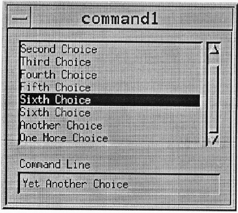
A CommandBox is a special-purpose composite component for command entry that provides a built-in command history mechanism. The CommandBox must be composed of a Text component with a command line prompt for command input, and a List component above the Text component for a command history area. The List must use either the single or browse selection model. When a List element is selected, its contents must be placed in the Text area. The default action of the CommandBox must be to pass the command in the Text area to the application for execution and to add the command to the end of the List. The List component can be scrollable.
The List navigation actions <Up arrow>,<Down arrow>,<Ctrl> <Begin>,and <Ctrl> <End> must be available from the Text component for moving the cursored element within the List and thus changing the contents of the Text. The List navigation actions <PageUp> and <PageDown> should also be available from the Text component for moving the cursored element within the List.
For more information, see the reference page in Section 9.9, "CommandDialog."
A CommandDialog should be used to enter commands for processing. It should not interrupt the user's interaction with the application. It should include a CommandBox.
For more information, see the reference page in Section 9.12, "DialogBox."
The Composition group should be used to organize components in an arbitrary layout. The layout style can be either arbitrary, in even rows and columns, or so that the position of components is relative to the Composition component and the components it contains. This component is composed of an area for organizing components.
This group must follow the navigation model as described in Chapter 3, "Navigation."
Any window can have a default action, although default actions are most frequently used in DialogBoxes. A DialogBox should have a default action associated with it. The default action in a window can change depending upon which component has the focus. The current default action should correspond to the action of some PushButton, called the current default PushButton of the window.
The current default PushButton must be highlighted in some way, usually by displaying a border around it. When the focus is on a PushButton, its action must be the default action, and the PushButton must show default highlighting. If the default action in a window varies, some PushButton must always have default highlighting, except when there is no current default action.
In a DialogBox, default PushButtons should be in the bottom area of PushButtons of the DialogBox. However, if a particular default action is associated with a cluster of controls in a window, the corresponding default PushButton can be located adjacent to the cluster.
When an explicit focus policy is in use, and the focus is outside the window, default highlighting should be placed on the PushButton whose action corresponds to the default action that would result from moving the focus to the window by using keyboard navigation among windows.
The default action of a DialogBox is activated according to the following rules:
If the focus is in a window, <Enter> and <Ctrl> <Return> must invoke the default action, and, if the focus is in a component in a window other than multiline Text, <Return> must invoke the default action. These actions must have no other effect on the component with the focus, unless the default action has some effect.
In list-like and graphics-like collections, when the location cursor is not on an activatable element, BSelect Click 2 should act like BSelect Click, followed by invocation of the default action.
When the focus is on a ToggleButton not used for expert activation, BSelect Click 2 should activate the ToggleButton and then perform the default action.
Except in the middle of a button motion operation, <Cancel> anywhere in a DialogBox must be equivalent to activating the Cancel PushButton in the DialogBox.
See Chapter 5, "Component Activation" for general information about the activation model and default activation.
A DialogBox should be used to group components in a window secondary to the main tasks of the application. Although a DialogBox can contain any components, a simple DialogBox is composed of a Label and PushButtons for supplying a response to the DialogBox. The OSF/Motif toolkit provides a number of ready-designed DialogBoxes for common uses: CommandDialog, FileSelectionDialog, MessageDialog, PromptDialog, and SelectionDialog. There are also a number of different types of MessageDialogs: ErrorDialog, InformationDialog, QuestionDialog, WorkingDialog, and WarningDialog. The illustration on this reference page shows a typical DialogBox.
DialogBox PushButtons should use the following common labels and actions. The actions are in the approximate sequence in which they should appear in DialogBoxes.
You should arrange PushButton actions in DialogBoxes like other PushButtons, according to order and frequency of use. The common action PushButtons should be ordered as presented in the previous list. Positive responses to the DialogBox should be presented first, followed by negative responses and canceling responses. Help should always be the last action on the right.
A DialogBox must follow the navigation model described in Chapter 3, "Navigation."
For more information, see the reference pages in Section 9.9, "CommandDialog," Section 9.15, "ErrorDialog," Section 9.19, "FileSelectionDialog," Section 9.27, "InformationDialog," Section 9.35, "MessageDialogs," Section 9.44, "PromptDialog," Section 9.46, "QuestionDialog," Section 9.55, "SelectionDialog," Section 9.60, "WarningDialog," and Section 9.62, "WorkingDialog."
Drag and drop provides a quick and simple model for transferring data within and between applications. A drag and drop interaction is accomplished in four steps:
The user selects elements to drag and grabs them with the pointer, or grabs an unselected element.
The user drags elements to the drop location.
The user drops the elements on the drop location.
The component dropped on processes the drop action.
Pressing Transfer in a draggable element and moving the pointer must start a drag and drop interaction. If a drag is initiated in an unselected region and the pointer is over two possible draggable elements, the drag must occur on the highest draggable element in the stacking order. This also implies that in nested draggable elements the drag occurs from the smallest draggable element under the pointer.
When BSelect is used for dragging operations, its use must supersede the use of BSelect Motion in the selection models described in Section 4.1, "Selection Models."
Any successful drag and drop transfer from a read-only component should by default result in a copy of the data, but it can result in a link. Transfers from writable components can by default result in a copy, a link, or a move. <Shift> BTransfer Release must force a move operation if possible; otherwise, the operation must fail. <Ctrl> BTransfer Release must force a copy operation if possible; otherwise, the operation must fail. <Ctrl> <Shift> BTransfer Release must force a link operation if possible; otherwise, the operation must fail.
If a system provides drag and drop help, pressing <Help> during a drag and drop operation should allow the posting of a DialogBox with the help information and the possible choices for continuing the drag and drop operation. Pressing <Cancel> during a drag operation must cancel the current drag operation and return the system to the state prior to the start of the drag operation.
Releasing BTransfer must end a drag and drop operation. When a user releases BTransfer, the drop operation must occur at the location of the hotspot of the drag icon pointer. The drop must occur into the highest drop site in the stacking order. This also implies that in a group of nested drop sites the drop occurs into the smallest drop site under the pointer.
See Section 4.3, "Transfer Models." for more information on the drag and drop model, and for information on quick transfer and the selection models.
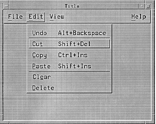
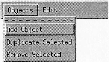
The common Edit Menu contents are described as follows. Note that you should only include those functions actually supported by your application. The Edit Menu can contain a TearOffButton. The illustration on this reference page shows an Edit Menu.
| Undo Alt+Backspace |
| |
| Cut Shift+Del |
| |
| Copy Ctrl+Ins |
| |
| Copy Link | Must copy a link of the selected portion of data to the clipboard without removing the original data from the client area. This action must choose the component to act on by following the rules in Section 4.2.2, "Operation Targets" for operations that act on selections. This action must have the mnemonic K. | |
| Paste Shift+Ins |
| |
| Paste Link | Must paste a link of the data represented by the contents of the clipboard into a client area. This action must choose the component to act on by following the rules in Section 4.2.2, "Operation Targets" for operations that do not act on selections. This action must have the mnemonic L. | |
| Clear | Must remove a selected portion of data from the client area without copying it to the clipboard. The remaining data is not compressed to fill the space that was occupied by the cleared data. This action must choose the component to act on by following the rules in Section 4.2.2, "Operation Targets" for operations that act on selections. This action must have the mnemonic E. | |
| Delete | Must remove a selected portion of data from the client area without copying it to the clipboard. This action must choose the component to act on by following the rules in Section 4.2.2, "Operation Targets" for operations that act on selections. This action must have the mnemonic D. | |
| Select All Ctrl+/ |
| |
| Deselect All Ctrl+\ |
| |
| Select Pasted |
| |
| Reselect Alt+Insert |
| |
| Promote Alt+Insert |
|
You should include Menu items in the order described. If you add new Menu items, you should insert them near similar elements.
If you use accelerators for Undo, Cut, Copy, and Paste, you must use either one or both of the models presented in the following two tables.
Table 9-3. Edit Menu Accelerators, Model 1
Edit Menu Item | Accelerator |
|---|---|
Undo | <Alt> <BackSpace> |
Cut | <Shift> <Delete> |
Copy | <Ctrl> <Insert> |
Paste | <Shift> <Insert> |
Table 9-4. Edit Menu Accelerators, Model 2
Edit Menu Item | Accelerator |
|---|---|
Undo | <Ctrl> <Z> |
Cut | <Ctrl> <X> |
Copy | <Ctrl> <C> |
Paste | <Ctrl> <V> |
In addition, if your keyboard has <Undo>,<Cut>,<Copy>,and <Paste> keys, these should be supported as accelerators for the corresponding Menu items as well.
See Chapter 6, "Application Design Principles" for more information on the MenuBar system and for general information about Menu design.
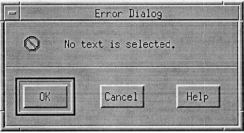
An ErrorDialog should be used to convey a message about a user error. It should stop user interaction with the application until it is dismissed. It should include an error symbol, a message, and one of the following button arrangements:
OK Cancel OK Cancel Help |
For more information, see the reference page in Section 9.12, "DialogBox."
Field controls are components that use internal navigation controls. Field controls should be navigation fields. The following text describes the field controls:
Field controls have navigation that is specific to the component. See the reference pages for each field control for information about its navigation.
Field controls have operations that are specific to the component. See the reference pages for each field control for information about its operations.
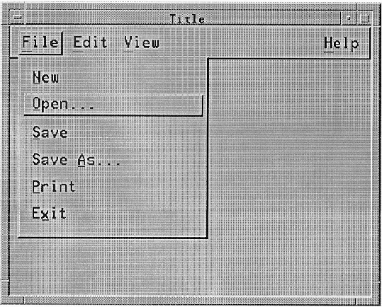
The common File Menu contents are described as follows. Note that you should only include those functions actually supported by your application. If the label File is not appropriate to the context of your application, you can choose a different, more appropriate label. The File Menu can contain a TearOffButton. The illustration on this reference page shows a File Menu.
See Chapter 6, "Application Design Principles" for more information on the MenuBar system and for general information about Menu design.
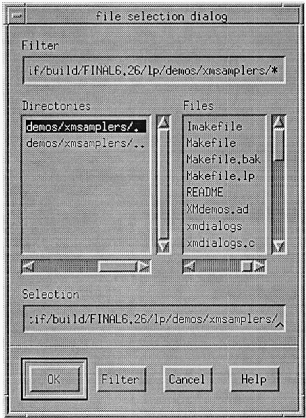
A FileSelectionBox is a special-purpose composite component for file selection. It can be used to traverse through directories, view the files and subdirectories in them, and then select files. The FileSelectionBox must be composed of at least the following components:
A Text component for displaying and editing a directory mask used to select the files to be displayed. The directory mask must be a string specifying the base directory to be examined and a search pattern.
A List component for displaying filenames. The file list should display all files and subdirectories in the base directory that match the search pattern. The List must use either the single or browse selection model.
A List component for displaying subdirectories. The directory list should display the subdirectories of the base directory, as well as the base directory itself and its parent directory. The List must use either the single or browse selection model.
A Text component for displaying and editing a filename.
A group of PushButtons, labeled OK, Filter, Cancel, and Help. If the FileSelectionBox is used to perform a specific action to the selected files, OK can be replaced by a label describing the action to be done.
Additional elements can be added by an application.
The user must be able to select a new directory to examine by scrolling through the list of directories and selecting the desired directory or by editing the directory mask. Selecting a new directory from the directory list must not change the search pattern. A user must be able to select a new search pattern by editing the directory mask.
The List navigation actions <Up arrow>,<Down arrow>,<Ctrl> <Begin>,and <Ctrl> <End> must be available from the Text components for moving the cursored element within each List and thus changing the contents of the Text. The List navigation actions <PageUp> and <PageDown> should also be available from the Text components for moving the cursored element within each List. The contents of the directory Text must correspond to the contents of the directory List, and the contents of the filename Text must correspond to the contents of the filename List.
The user must be able to select a file by scrolling through the list of filenames and selecting the desired file or by entering the filename directly into the Text component. Selecting a file from the list causes that filename to appear in the file selection Text component.
The user can select a new file as many times as desired. The application must not be notified until one of the following events occurs:
The user activates the OK PushButton.
The user presses <Enter> or <Return> while the filename Text component has the keyboard focus.
The user presses <Enter> or <Return> while the location cursor is on an item in the file List.
The user double-clicks BSelect on an item in the file List.
The FileSelectionBox must initiate a directory and file search when any of the following occurs:
The FileSelectionBox is initialized.
The user activates the Filter PushButton.
The user double-clicks or presses <Enter> or <Return> on an item in the directory List.
The user presses <Enter> or <Return> while the directory mask Text edit area has the keyboard focus.
For more information, see the reference page in Section 9.19, "FileSelectionDialog."
A FileSelectionDialog should be used to enter the name of a file for processing. It should not interrupt the user's interaction with the application. It should include a FileSelectionBox.
For more information, see the reference page in Section 9.12, "DialogBox."
The keyboard focus model is defined by a focus policy. A focus policy is a specific mechanism for moving the focus among windows and components. The implicit and explicit focus policies must be supported.
In the implicit focus policy, also called the pointer, real-estate driven, or point-to-type policy, the keyboard focus moves to the window or component into which a user moves the mouse pointer. No explicit action is performed to set the keyboard focus in the implicit focus model. Keyboard events are sent to the window or component that the mouse pointer is in, more specifically to the component that the mouse pointer is in. In implicit mode, the keyboard focus tracks the mouse pointer. Because of this, there is no way to move the keyboard focus from the keyboard using implicit mode. In this focus policy, the location cursor for keyboard events does not need to be shown; however, the application can show it.
The explicit focus policy requires the user to explicitly select which window or component receives the keyboard focus. In explicit focus mode at the window level, a user moves the keyboard focus to a window by pressing BSelect while the mouse pointer is over the window. Simply moving the mouse pointer over a window does not give the window the keyboard focus. Because of this, explicit mode is often called click-to-type. In explicit mode within a window, a user generally moves the keyboard focus to a specific component within a window by pressing BSelect over the component. Pressing BSelect must not move focus to a component that is not traversable or does not accept input. Pressing BSelect in a component that is used only to change the visible portion of another component, such as a ScrollBar or Sash, should act on that component but should not move focus to it. In this focus policy, the location of keyboard focus must be shown by a location cursor.
See Chapter 2, "Input Models" for more information about the focus model.
A Frame should be used to frame other components. It simply provides a decorative border.
Framing groups are used to frame groups of components as the following text describes:
These groups must follow the navigation model as described in Chapter 3, "Navigation."
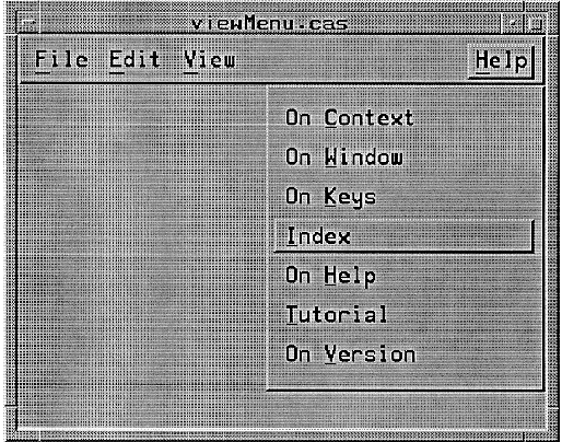
There are two acceptable models for the contents of the Help Menu. The OSF/Motif Style Guide allows either model.
The common Menu contents for this model are described in the following text. Note that you should only include those functions actually supported by your application. The Help Menu can contain a TearOffButton. The illustration on this reference page shows this first model of a Help Menu.
| On Context Shift+Help |
| |
| On Help | Must provide information on how to use the application's help facility. This action must have the mnemonic H. | |
| On Window |
| |
| On Keys | Must provide information about the application's use of function keys, mnemonics, and keyboard accelerators. This action must have the mnemonic K. | |
| Index | Must provide an index for all help information in the application. This action must have the mnemonic I. The index can provide search capabilities. | |
| Tutorial | Must provide access to the application's tutorial. This action must have the mnemonic T. | |
| On Version | Must provide the name and version of the application. This action must have the mnemonic V. It can provide other information as well. |
The common Menu contents in the second model are described in the following text. Note that you should only include those functions actually supported by your application. The Help Menu can contain a TearOffButton.
| Context-Sensitive Help Shift+Help |
| |
| Overview | Must provide general information about the application window from which help was requested. This action must have the mnemonic O. | |
| Index | Must provide an index for all help information in the application. This action must have the mnemonic I. The index can provide search capabilities. | |
| Keyboard | Must provide information about the application's use of function keys, mnemonics, and keyboard accelerators. This action must have the mnemonic K. | |
| Tutorial | Must provide access to the application's tutorial. This action must have the mnemonic T. | |
| Using 'Help | Must provide information on how to use the application's help facility. This action must have the mnemonic H. | |
| Product Information |
|
Applications should place additional Help Menu items between Index and Using Help.
Help is usually provided in DialogBoxes but can also appear in the message area. You should include Menu items in the order described. If you add new Menu items, you should insert them near similar elements.
See Chapter 6, "Application Design Principles" for more information on the MenuBar system and for general information about Menu design.
Clicking BSelect in an icon must give the icon the keyboard focus and post the icon Menu. The icon Menu must be the same Menu as the window Menu for the associated primary window. Size should not be available from the icon Menu. Navigating to the icon must also give the icon the keyboard focus and should post the icon Menu.
Double-clicking BSelect anywhere in the icon must restore the window family, just as the icon Menu item Restore does. If the window is currently minimized, but its previous state was maximized, double-clicking BSelect returns it to the maximized state. Selecting Maximize from the icon Menu always maximizes the corresponding window. If the window is minimized, Minimize must not be available in the icon Menu; otherwise, selecting it minimizes the window family. Pressing BSelect or BTransfer anywhere in the icon and dragging the mouse pointer must move the icon to track the pointer, just as the icon Menu item Move does.
If the window manager has been customized by the user so that the icon Menu does not pop up when the icon gets the focus, <Shift> <Escape>,<Alt> <Space>,<Menu>,and BMenu must pop up the icon Menu.
See Chapter 7, "Window Manager Design Principles" for more information on the icon Menu and the window manager in general. See Chapter 6, "Application Design Principles" for information about Menu design.
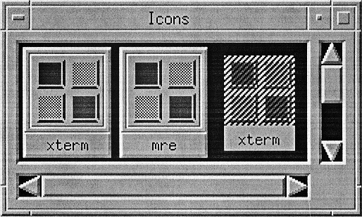
An icon box is a specialized window that acts as a storage location for icons. An icon box acts like a typical window in the sense that it has a window frame and frame components. The client area of an icon box must have an area for holding icons and can have horizontal and vertical scroll bars for moving around the icon area.
The icon box must have all the same components as any other primary window. Like other windows it can be sized, moved, minimized, maximized, restored, and lowered. However, the window manager must not allow the icon box to be closed. The system Menu action Close must be replaced with the system Menu action Pack Icons in an icon box. Double-clicking BSelect in the icon box system Menu must only open the icon box system Menu. It must not close the icon box. Pack Icons arranges the icons as close as possible together in the visible icon area if possible. Pack Icons must have the mnemonic P. If Pack Icons has an accelerator, it should be <Alt> <F12> if <F12 > is available. When the input focus is in the icon box, <Shift> <Escape> or <Alt> <Space> must pop up the icon box system Menu if the Menu is unposted. If the Menu is already posted, <Shift> <Escape> or <Alt> <Space> must unpost the Menu.
The icon box can contain an icon for each window family, even if it is active. The icon for minimized window families must be the same as the icon would be outside of the icon box. The icon for an active window family should be similar to the minimized icon, deemphasized somehow.
Clicking BSelect in an icon must give the icon keyboard focus and post the icon Menu. The icon Menu must be the same Menu as the window Menu for the associated primary window. If the icon represents an active window family, Restore and Size must not be available from the icon Menu. If the icon represents a minimized window family, Size must not be available from the icon Menu. If the window manager is customized so that the icon with the focus does not have its window Menu automatically posted, BMenu or <Menu> must post its Menu.
Double-clicking BSelect anywhere in an icon that represents a minimized window family must restore the window family, just as the icon Menu item Restore does. Double-clicking BSelect anywhere in an icon that represents an active window family must raise the window family to the top of the window hierarchy. If the window is currently minimized, but its previous state was maximized, double-clicking BSelect returns it to the maximized state. Selecting Maximize from the icon Menu always maximizes the corresponding window. If the window is minimized, Minimize must not be available in the icon Menu; otherwise, selecting it minimizes the window family. Pressing BSelect or BTransfer anywhere in the icon and dragging the mouse pointer must move the icon within the icon area to track the pointer, just as the icon Menu item Move does.
The <Down arrow>,<Up arrow>,<Right arrow>,and <Left arrow> directional keys must navigate among the icons in the icon box. Icon navigation must behave as described in the following text. Note that <Down arrow> and <Right arrow> do not need to traverse icons in the same order.
| <Down arrow> |
| |
| <Left arrow> |
| |
| <Right arrow> |
| |
| <Up arrow> | This key must move the location cursor through the icons in the opposite direction of <Down arrow>. |
See Chapter 7, "Window Manager Design Principles" for more information about icons and the window manager.
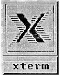
An icon is a stylized representation of an object. A window icon is a minimized representation of a window or window family that can help organize windows and tasks in the display. Iconifying a window is also known as minimizing a window. The window manager must iconify all windows of window family together. It must not iconify any single window, primary or secondary, from a window family without also iconifying all the other windows in the window family. The iconic representation of a window family should not change any state in the windows, except the visual representation of the window. The application running inside of a window must continue running even when the application is iconified. The application can adjust its own state when it is iconified.
An icon is made up of an image and a label. The illustration on this reference page shows a typical Motif icon.
The image should be surrounded by a border that indicates when the icon has the keyboard focus. The image area can contain text or a bitmap. The label should be located just below the image and its border. The label can also indicate when the icon has the keyboard focus by highlighting with the image area.
The label should contain the same text as the title area of the corresponding primary window, or an abbreviated form of it. When the icon does not have the keyboard focus, the width of the label must be the same as the width of the image area and its border, truncating text if necessary. When the icon has the keyboard focus, the width of the label can expand to display the entire text.
Clicking BSelect in an icon must give the icon keyboard focus and should post the icon Menu. Navigating to the icon must also give the icon the keyboard focus and should post the icon Menu.
Double-clicking BSelect anywhere in the icon must restore the window family, just as the icon Menu item Restore does. If the window is currently minimized, but its previous state was maximized, double-clicking BSelect returns it to the maximized state. Selecting Maximize from the icon Menu always maximizes the corresponding window. If the window is minimized, Minimize must not be available in the icon Menu; otherwise, selecting it minimizes the window family. Pressing BSelect or BTransfer anywhere in the icon and dragging the mouse pointer must move the icon to track the pointer, just as the icon Menu item Move does.
If the window manager has been customized by the user so that the icon Menu does not pop up when the icon gets the focus, <Shift> <Escape>,<Alt> <Space>,<Menu>,and BMenu must pop up the icon Menu.
See Chapter 7, "Window Manager Design Principles" for more information about icons and the window manager.
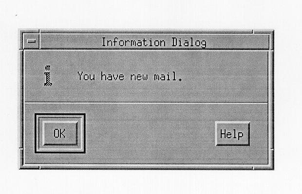
An InformationDialog should be used to convey information to the user. It must not interrupt the user's interaction with the application. It should include an information symbol, a message, and one of the following button arrangements:
OK OK Help |
For more information, see the reference page in Section 9.12, "DialogBox."
The most typical pointing device is a mouse, although a graphics tablet, track ball, joystick, and other tools also work as pointing devices. You can use any pointing device in place of a mouse. This guide assumes that a mouse, or any pointing device, has the following three buttons. Chapter 2, "Input Models" describes the button bindings for pointing devices that do not have three buttons.
| BSelect | Used for selection, activation, and setting the location cursor. This button must be the leftmost button, except for left-handed users where it can be the rightmost button. | |
| BTransfer | Used for moving and copying elements. This button must be the middle mouse button, unless dragging is integrated with selection. Details about the effects of integrating BTransfer with BSelect are described in Chapter 4, "Selection." | |
| BMenu | Used for popping up Menus. This button must be the rightmost button, except for left-handed users where it can be the leftmost button. |
Since not all keyboards are the same, it is difficult to give style guidelines that are correct for every manufacturer's keyboard. To solve this problem, this guide describes keys using a model keyboard mechanism. Wherever keyboard input is specified, the keys are indicated by the engraving they have on the OSF/Motif model keyboard. The model keyboard does not correspond directly to any existing keyboard; rather, it assumes a keyboard with an ideal set of keys.
In addition to the standard letter, number, and character keys, the OSF/Motif model keyboard is composed of the following special keys:
The special printing characters </>,<\>,and <!>
The standard modifier keys <Ctrl>,<Alt>,and <Shift>
Ten function keys <F1> through <F10>
The arrow keys <Down arrow>,<Left arrow>,<Right arrow>,and <Up arrow>
<BackSpace>
<Cancel>
<Delete>
<End>
<Escape>
<Help>
<Home>
<Insert>
<Menu>
<PageDown>
<PageUp>
<Return>
<Space>
<Tab>
The OSF/Motif model keyboard also contains the following optional keys, which although useful, either are not necessary or can be replaced by combinations of other keys:
<CapsLock>
<Copy>
<Cut>
<Enter>
<ModeSwitch>
<NumLock>
<PageLeft>
<PageRight>
<Paste>
<ScrollLock>
<Select>
<Undo>
Throughout this guide, behavior is described in terms of model keyboard keys. When a behavior takes advantage of an optional key from the model keyboard, it is also described in terms of the required special keys. Each of the nonoptional keys described on the OSF/Motif model keyboard must be available either as specified or by using other keys or key combinations if the specified key is unavailable.
See Chapter 2, "Input Models" for a more information about input devices.
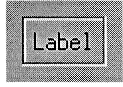
A Label should be used to display text or graphics that label other components. This component must be composed of an area for displaying a text or graphics label.
Layout groups are used for organizing components into groups as described in the following text:
Layout groups must follow the navigation model as described in Chapter 3, "Navigation."
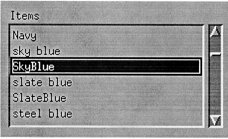
A List should be used to present a list of elements for selection. The List elements can be selected using either the single selection model, the browse selection model, the multiple selection model, or the discontiguous selection model. This component must be composed of an area for presenting a list of text or graphics elements. It can optionally have vertical and horizontal ScrollBars, which show different views of the List elements.
The location cursor in a List should differentiate between normal mode and add mode. The location cursor should be a solid box in normal mode and a dashed box in add mode.
The following text describes the navigation actions of this component:
| <Ctrl> <Begin> |
| |
| <Ctrl> <End> |
| |
| <Up arrow> | Must move the location cursor to the previous item in the List. | |
| <Down arrow> |
| |
| <PageDown> | In a scrollable List, must move the location cursor to the item one page down in the List. | |
| <PageUp> | In a scrollable List, must move the location cursor to the item one page up in the List. |
The following text describes the operations of this component:
| BSelect Click 2 |
| |
| <Begin> | In a scrollable List, must move the horizontal scroll region so that the leftmost edge of the List is visible. | |
| <End> | In a scrollable List, must move the horizontal scroll region so that the rightmost edge of the List is visible. | |
| <Left arrow> |
| |
| <PageLeft> or <Ctrl> <PageUp> | | |
| <Right arrow> | | |
| <PageRight> or <Ctrl> <PageDown> | | |
| <Help> | Must provide any available help for the List. |
For more information on List element selection, see the description of the selection models in Chapter 4, "Selection." For more information about the ScrollBars, see the reference page in Section 9.51, "ScrollBar."
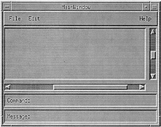
A MainWindow should be used to organize the contents of a primary window. A MainWindow must frame the client area and can optionally include ScrollBars, a MenuBar, a command area, and a message area.
A MainWindow must follow the navigation model described in Chapter 3, "Navigation."
For more information about the components of the MainWindow, see the reference pages in Section 9.33, "MenuBar," Section 9.51, "ScrollBar," and Section 9.58, "Text."
A MenuBar is a basic group that organizes the most common features of an application. The MenuBar must be a horizontal bar at the top edge of the application just below the title area of the window frame. The MenuBar contains a list of Menu topics in CascadeButtons with Pulldown Menus connected to them. A MenuBar must contain only CascadeButtons, because other buttons inhibit Menu browsing. Each Menu topic should have a single-letter mnemonic indicated by underlining.
The following Pulldown Menus provide general functions common to most applications. Remember that these Menu guidelines, like all the guidelines in this OSF/Motif Style Guide, apply only in a left-to-right language environment in an English-language locale. You need to make the appropriate changes for other locales.
While we recommend that you include the common Menus in the MenuBar of your application, your choice of Menu titles and items depends on the nature of your application. If your application requires it, you should design more relevant titles and selections, but do not change the meanings of items used in the common Menus.
If any of the common Menus are present, they must be arranged in the following order with respect to each other, ranging from left to right across the MenuBar in a left-to-right language environment:
File Menu Selected Menu Edit Menu View Menu Options Menu Help Menu |
You can omit any of these Menus if they are not relevant to the application. You can also intersperse other, application-specific, Menus among these Menus. However, if a File Menu is present, it must be the first Menu and must be placed at the far left of the MenuBar. If a Help Menu is present, it must be the last Menu and must be placed at the far right of the MenuBar.
The recommended contents of the File, Edit, and Help Menus are described on their own reference pages. The contents of the View and Options Menus are application specific and are not specified here. Each of these common Menus can contain a TearOffButton.
The MenuBar follows the navigation model described in Chapter 3, "Navigation."
The following text describes the operations of this component:
| <Help> | Must provide any available help for the current CascadeButton. |
For information about the suggested contents of these Menus, see the reference pages in Section 9.17, "File Menu," Section 9.14, "Edit Menu," and Section 9.23, "Help Menu."
Menus should be used to organize a collection of basic controls in a horizontal, vertical, or 2-dimensional layout within a separate Menu window. There are three types of Menus: Pulldown, Popup, and Option. A Menu is only available while it is posted.
Menus follow the navigation model described in Chapter 3, "Navigation."
The following text describes the operations of this component:
| <Help> | Must provide any available help for the Menu. |
For more information, see the reference pages in Section 9.6, "CascadeButton," Section 9.38, "OptionButton," and Section 9.33, "MenuBar."
MessageDialogs should be used to convey a message to the user. They must not interrupt the user's interaction with the application. They should include a message and one of the following button arrangements:
OK OK Help OK Cancel OK Cancel Help Yes No Yes No Help Yes No Cancel Yes No Cancel Help Cancel Cancel Help Retry Cancel Retry Cancel Help |
There are a number of different types of MessageDialogs: ErrorDialog, InformationDialog, QuestionDialog, WorkingDialog, and WarningDialog.
For more information, see the reference pages in Section 9.12, "DialogBox," Section 9.15, "ErrorDialog," Section 9.27, "InformationDialog," Section 9.46, "QuestionDialog," Section 9.62, "WorkingDialog," and Section 9.60, "WarningDialog."
A mnemonic is a single character that can be associated with any component that contains a text label. The label must contain the character, and the character must be underlined within the label. The mnemonic should be the first character of the label. If a label does not naturally contain the character of the mnemonic, the mnemonic must be placed in parentheses following the label. Labels can also be sequentially numbered, and the number can serve as the mnemonic. Labels that are duplicated within an application should be given the same mnemonic. Mnemonics must be case insensitive for activation. Either an uppercase or lowercase letter can be underlined in the label.
When the location cursor is within a Menu, or a MenuBar, typing the mnemonic character of a component within that Menu or MenuBar must move the location cursor to the component and activate it. If a mnemonic is used for an OptionButton or for a CascadeButton in a MenuBar, pressing <Alt> and the mnemonic anywhere in the window or its Menus must move the cursor to the component with that mnemonic and must activate it.
Collections can also support mnemonics associated with its elements. Pressing a mnemonic key while the collection has the keyboard focus must be equivalent to moving the location cursor to the element and pressing <Select> or <Space>.
Using a mouse, navigation is a simple matter of moving the mouse pointer. Using the keyboard, the following component navigation actions must be available:
See Chapter 3, "Navigation" for more information about internal window navigation. See Chapter 7, "Window Manager Design Principles" for more information about navigation among windows.
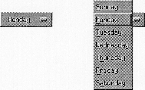
An OptionButton should be used to post an Option Menu.
This component must be composed of a button, with either a text or graphics Label. Following the Label, this component should also include a bar graphic to distinguish it from a PushButton. The Label must be the last selection made from the OptionButton.
The following text describes the operations of this component:
| BSelect Press |
| |
| BSelect Release |
If the release is outside of the OptionButton, the associated Option Menu must be unposted. | |
| <Select> or <Space> |
| |
| <Cancel> | Must unpost the last posted Menu in the Menu system without changing the value of the OptionButton. | |
| <Help> | Must provide any available help for the OptionButton. |
For more information, see the reference page in Section 9.34, "Menus."
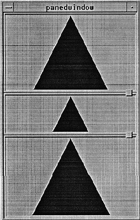
A PanedWindow should be used to group components into Panes separated by Sashes and Separators for adjusting the relative size of each Pane. This component must be composed of any number of groups of components, called Panes, each separated by a Sash and a Separator. The Panes, Sashes, and Separators must be grouped linearly, either horizontally or vertically. A Sash must be composed of a handle on the Separator between two Panes for adjusting the position of the Separator, and therefore the size of the Panes next to it.
As a Sash is moved, the Pane in the direction of the Sash movement must get smaller and the other Pane must get larger by an equal amount. If a Pane is adjusted to its minimum size, adjustment should continue with the next Pane in the direction of the Sash movement.
This component must follow the navigation model described in Chapter 3, "Navigation."
A Panel group should be used to organize a collection of basic controls in a horizontal, vertical, or 2-dimensional layout. This component is usually composed of just one type of basic control. This component is composed of an area for organizing basic controls.
The <Down arrow>,<Left arrow>,<Right arrow>,and <Up arrow> direction keys must navigate among components in the Panel according to the navigation model described in Chapter 3, "Navigation."
You should not create new mouse pointer shapes for functions that already have mouse pointer shapes associated with them, except for localization; however, you can create new mouse pointer shapes for functions not already associated with a pointer shape. You should not use a predefined shape to symbolize a function it was not designed to represent.
A list of the defined pointer shapes follows, along with their usage and hotspots. The hotspot of a pointer is the actual position on the pointer that tracks the movements of the mouse. As the pointer changes from one shape to another, the location of the hotspot must not move on the screen. The hotspot is the precise location on the pointer where mouse actions occur.

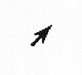
The upper-left pointing arrow pointer is a general-purpose pointer. It is used in most window areas for single-object selection and activation. The hotspot for the arrow pointer should be in the point of the arrow.

You can optionally use an I-beam pointer in any Text component. It is used to change the location of the text insertion cursor and to perform actions on text. If the I-beam is used, it can be hidden during the time between any keyboard action and a mouse movement. This helps the user distinguish the I-beam pointer from the text insertion cursor, which can also be an I-beam. The hotspot for the I-beam pointer should be on the vertical bar of the I-beam about one-third up from the bottom.
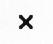
The X pointer can indicate when the pointer is outside of any application area. The hotspot for the X pointer should be where the lines intersect.
The resize pointers indicate positions for area resize, and they remain during a resize operation. The direction of the arrow in the pointer indicates the direction of increasing size. The horizontal and vertical pointers indicate resize in either the horizontal or vertical direction. The diagonal pointers indicate resize in both the horizontal and vertical directions simultaneously. The hotspot for the resizing pointers should be on the elbow or the line at the position pointed to by the arrow.

The hourglass pointer, a working pointer, indicates that an action is in progress in the area, and that the pointer has no effect in the area. While the hourglass pointer is active, all mouse button and keyboard events are ignored in the area. The hotspot for the hourglass pointer should be located at the center of the hourglass, although it should not be used for activation. The hourglass pointer can be used interchangeably with the watch pointer.
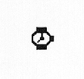
The watch pointer, a working pointer, indicates that an action is in progress in the area, and that the pointer has no effect in the area. While the watch pointer is active, all mouse button and keyboard events are ignored in the area. The hotspot for the watch pointer should be located at the top of the watch, although it should not be used for activation. The watch pointer can be used interchangeably with the hourglass pointer.

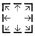
The 4-directional arrow pointer indicates a move operation is in progress, or a resize operation before the resize direction has been determined. During a move operation, the object, or an outline of the object should move to track the location of the pointer. During a resize operation, the pointer is used to indicate a direction for resizing. The 4-directional arrow pointer should change to the appropriate resize arrow when the resize direction is determined, either by crossing an object boundary with the pointer or by pressing a keyboard direction key. The hotspot for the 4-directional arrow pointer should be at the spot where the arrows intersect.

The sighting pointer is used to make fine position selections. For example, in a drawing program it can be used to indicate a pixel to fill or the connecting points of lines. The hotspot for the sighting pointer should be at the spot where the lines intersect.

The caution pointer is used to indicate that action is expected in another area before input can be given to the current area, and that the pointer has no effect in the area. While the caution pointer is active, all mouse button and keyboard events are ignored in the area. The hotspot for the caution pointer should be located at the center of the caution symbol, although it should not be used for activation.

The question pointer is used to request an input position or component from the user. This is often used to input an object for interactive help. The user requests interactive help, then the question pointer is displayed to allow the user to indicate what position or component help is requested for. The hotspot for the question pointer should be at the bottom of the question mark.
You can optionally use an arrow pointing to the upper-right corner to indicate a pending Menu action. This shape indicates that a Menu is popped up or pulled down and waiting for a Menu item to be activated or the Menu to be removed. The hotspot for this arrow pointer should be in the point of the arrow.
See Chapter 2, "Input Models" for information on the input device model and designing new pointer shapes.
The common Popup Menu contents are described as follows. Note that you should only include those functions actually supported by your application. The illustration on this reference page shows a Popup Menu.
Appropriate words, such as Selection or words denoting the type of a single element of the collection as a whole, should be added to a Label to specify which elements are affected. For example, if a Popup Menu contains the entry Copy Selection, the current selection is copied to the clipboard regardless of where in the collection the Menu is popped up.
A Popup Menu item should only have an accelerator if the result of typing the accelerator would be equivalent to popping up the Menu by typing <Menu>,and then selecting the Menu item. If Cut Selection is included in a Popup Menu, it should use the same accelerators as Cut in the Edit Menu. If Copy Selection is included in a Popup Menu, it should use the same accelerators as Copy in the Edit Menu.
See Chapter 6, "Application Design Principles" for more information on Popup Menus and for general information about Menu design.
Each collection maintains its own selection. A selection need not contain any elements, in which case it is said to be an empty selection. At any time, there is one selection called the primary selection, which is the last selection explicitly started by the user.
Clicking BSelect or <Ctrl> BSelect only moves the primary selection to a collection when it results in making a selection that is not empty. When <Shift> BSelect is clicked, an implementation can move the primary selection to the component even if the resulting selection is empty. Dragging BSelect, <Shift> BSelect, or <Ctrl> BSelect must move the primary selection to the component if a button release during the pointer motion could have potentially selected any element.
A selection is said to be persistent if it is highlighted even when it is not the primary selection.
| Persistent | There are two variants of persistent selections: persistent always, in which the current selection is always highlighted, and persistent on focus, in which the current selection is only highlighted when it is the primary selection or when the collection has the keyboard focus. In either case, stronger highlighting should be used when the current selection is also the primary selection. When focus is in the collection, <Alt> <Insert> can be used to promote the current selection to the primary selection. | |
| Nonpersistent |
|
Collections that are never editable (such as noneditable Lists) should always use persistent selections. Collections that are editable can either use persistent or nonpersistent selections.
Primary transfer can be invoked by clicking BTransfer or through standard keyboard bindings. There are three primary transfer operations:
| Primary Copy |
| |
| Primary Move |
| |
| Primary Link |
|
See Section 4.2, "Selection Actions" and Section 4.3, "Transfer Models" for more information about the primary selection.
A PrompDialog should be used to prompt the user for input. It can interrupt the user's interaction with the application. It should include a message, a text input area, and one of the following button arrangements:
OK Cancel OK Cancel Help OK Apply Cancel OK Apply Cancel Help OK Apply Reset Cancel OK Apply Reset Cancel Help |
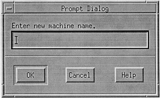
For more information, see the reference page in Section 9.12, "DialogBox."
A PushButton should be used to start an operation. A PushButton must contain either a text or graphic Label that indicates the operation of the button.
The following text describes the operations of this component:
| BSelect Press |
| |
| BSelect Release |
| |
| <Enter> or <Return> |
| |
| <Select> or <Space> |
| |
| <Help> | Must provide any available help for the PushButton. |
A QuestionDialog should be used to get a user response to a question. It should interrupt the user's interaction with the application. It should include a question symbol, a message, and one of the following button arrangements:
Yes No Yes No Help |
It is possible that both the Yes and No actions of a Question DialogBox will perform an action. If this is the case, the Question DialogBox should use one of the following button arrangements:
Yes No Cancel Yes No Cancel Help |
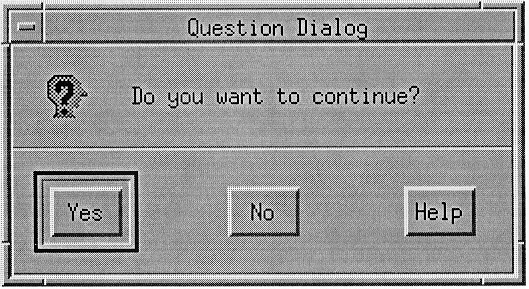
For more information, see the reference page in Section 9.12, "DialogBox."
Quick transfer is used to make a temporary (or secondary) selection and then immediately copy, move, or link that selection to the insertion position of the destination component. Quick transfer is implemented using <Alt> BTransfer Motion, with the standard modifiers used to force the various transfer operations.
Text components must support quick transfer.
There are three quick transfer operations:
The range of the temporary selection must be determined by using exactly the same model used when BSelect Motion determines the range of a primary selection.
Section 4.3, "Transfer Models" for more information about quick transfer.
A RadioButton should be used to select one option from a number of options. A RadioButton is a special case of a ToggleButton. Only one RadioButton can be set at a time. This component must be composed of a text or graphic label, and a graphic that indicates the state of the RadioButton. The graphic indicator for a RadioButton is usually a filled diamond or circle to indicate the on state or an empty diamond or circle to indicate the off state. On color systems, the on state color can be distinct from general application colors to visually distinguish the on state.
The following text describes the operations of this component:
| BSelect Press | Must arm the RadioButton. If the RadioButton was previously unset, it must show the RadioButton in the set state. | |
| BSelect Release | | |
| BSelect Release 2 | | |
| <Enter> or <Return> |
| |
| <Select> or <Space> | | |
| <Help> | Must provide any available help for the RadioButton. |
For more information, see the reference pages in Section 9.7, "CheckButton" and Section 9.59, "ToggleButton."
A Sash should be used to adjust the border between groups of components in a PanedWindow. A Sash must be composed of a handle on the Separator between two Panes for adjusting the position of the Separator, and therefore the size of the Panes next to it.
As a Sash is moved, the Pane in the direction of the Sash movement must get smaller and the other Pane must get larger by an equal amount. If a Pane is adjusted to its minimum size, adjustment should continue with the next Pane in the direction of the Sash movement. The PanedWindow can optionally support movement of the Pane in the initial direction of mouse movement with the modifier <Shift> on button events, rather than resizing the Pane.
The following text describes the operations of this component:
| BSelect or BTransfer Motion | | |
| BSelect or BTransfer Motion | | |
| <Up arrow> and <Down arrow> | | |
| <Right arrow> and <Left arrow> | | |
| <Shift> <Up arrow> and <Shift> <Down arrow> | | |
| <Shift> <Right arrow> and <Shift> <Left arrow> | | |
| <Ctrl> <Up arrow> and <Ctrl> <Down arrow> | | |
| <Ctrl> <Right arrow> and <Ctrl> <Left arrow> | | |
| <Ctrl> <Shift> <Up arrow> and <Ctrl> <Shift> <Down arrow> | | |
| <Ctrl> <Shift> <Right arrow> and <Ctrl> <Shift> <Left arrow> | | |
| <Help> | Must provide any available help for the Sash. |
For more information, see the reference page in Section 9.39, "PanedWindow."
A Scale should be used to select a value from a range. This component should be composed of a slider, moving within an element that indicates the size of the range, called the trough, and a Label that indicates the current value. The position of the slider indicates the value relative to the range. A Scale can also have buttons with arrow graphics for moving the slider.
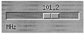
The following text describes the operations of this component:
| BSelect Press | In an arrow button, this action must move the slider one increment in the direction of the side of the slider on which the button was pressed, and autorepeat until the button is released. In the trough, if the Scale has tick marks, BSelect Press must move the slider one major tick mark in the direction of the side of the slider on which the trough was pressed, and autorepeat until the button is released. It can stop when the slider reaches the position of the pointer. If the Scale does not have tick marks, BSelect Press in the trough must move the slider one large increment in the direction of the side of the slider on which the trough was pressed, and autorepeat until the button is released. It can stop when the slider reaches the position of the pointer. | |
| BSelect Motion |
| |
| <Ctrl> BSelect Press |
| |
| BTransfer Press |
| |
| BTransfer Motion |
| |
| <Cancel> | If a mouse-based sliding action is in progress, <Cancel> must cancel the sliding action and return the slider to its position prior to the start of the sliding operation. | |
| <Down arrow> |
| |
| <Up arrow> | For vertical Scales, this action must move the slider one increment up. | |
| <Left arrow> | | |
| <Right arrow> |
| |
| <Ctrl> <Down arrow> |
| |
| <Ctrl> <Up arrow> |
| |
| <Ctrl> <Left arrow> |
| |
| <Ctrl> <Right arrow> |
| |
| <Begin> or <Ctrl> <Begin> |
| |
| <End> or <Ctrl> <End> |
| |
| <Help> | Must provide any available help for the Scale. |
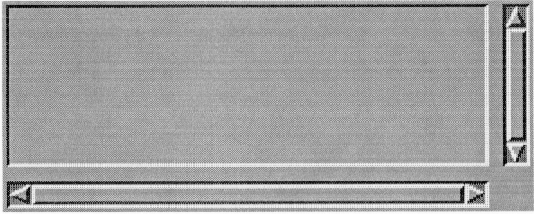
A ScrollBar should be used to scroll the visible area of another component. A ScrollBar should be composed of a slider, moving within an element that indicates the full size of the scrolled component, and two buttons with arrow graphics for moving the slider. The slider indicates the relative position and size of the visible area of the scrolled component.
The following text describes the operations of this component:
| BSelect Press | In an arrow button, this action must move the slider one increment in the direction of the side of the slider on which the button was pressed, and autorepeat until the button is released. In the trough, this action must move the slider one page in the direction of the side of the slider on which the trough was pressed, and autorepeat until the button is released. It can stop when the slider reaches the position of the pointer. | |
| BSelect Motion | | |
| <Ctrl> BSelect Press | | |
| <Shift> BSelect Press | | |
| BTransfer Press | | |
| BTransfer Motion | | |
| <Cancel> | If a mouse-based scrolling action is in progress, <Cancel> must cancel the scrolling action and return the slider to its position prior to the start of the scrolling operation. | |
| <Down arrow> |
| |
| <Up arrow> | For vertical ScrollBars, this action must move the slider one increment up. | |
| <Left arrow> |
| |
| <Right arrow> | | |
| <Ctrl> <Down arrow> | | |
| <Ctrl> <Up arrow> | | |
| <Ctrl> <Left arrow> | | |
| <Ctrl> <Right arrow> | | |
| <PageDown> | For vertical ScrollBars, this action must move the slider one page down. | |
| <PageUp> | For vertical ScrollBars, this action must move the slider one page up. | |
| <PageLeft> or <Ctrl> <PageUp> | | |
| <PageRight> or <Ctrl> <PageDown> | | |
| <Begin> or <Ctrl> <Begin> | | |
| <End> or <Ctrl> <End> | | |
| <Help> | Must provide any available help for the ScrollBar. |
A ScrolledWindow should be used to frame other components and to provide ScrollBars as necessary to scroll the visible area of the framed components. When the area framed by the ScrolledWindow is completely displayed, the ScrollBars need not be displayed. When the area provided in the ScrolledWindow is too small to display the entire component area, the ScrollBars must be displayed and must then allow scrolling of the visible area.
A ScrolledWindow must follow the navigation model that is described in Chapter 3, "Navigation."
For information about the activation of the ScrollBars, see the reference page for ScrollBar. For more information about navigation within general scrollable components, see Section 3.4, "Scrollable Component Navigation."
The selection model determines how elements are selected from a group of elements. OSF/Motif compliant systems must support the five different selection models. The five selection models are as follows:
| Single Selection | | |
| Browse Selection | | |
| Multiple Selection | | |
| Range Selection | | |
| Discontiguous Selection | |
See Chapter 4, "Selection" for more information about the selection models.
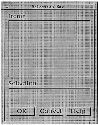
A SelectionBox is a special-purpose composite component for making selections from a list of choices. The SelectionBox must be composed of at least a Text component for the selected alternative and a List component above the Text component for presenting the alternatives. Both the List and Text components should have a Label above them. The List component can be scrollable. The SelectionBox should also include one of the following button arrangements:
OK Cancel Help OK Cancel Apply Help |
The List must use either the single or browse selection model. Selecting an element from the list must place the selected element in the Text component. Entering an item name into the Text component should make that element visible in the List component. The List navigation actions <Up arrow>,<Down arrow>,<Ctrl> <Begin>,and <Ctrl> <End> must be available from the Text component for moving the cursored element within the List and thus changing the contents of the Text. The List navigation actions <PageUp> and <PageDown> should also be available from the Text component for moving the cursored element within the List.
For more information, see the reference page in Section 9.55, "SelectionDialog."
A SelectionDialog should be used to allow a user to make a selection from a list of choices. It can interrupt the user's interaction with the application. It should contain a SelectionBox.
For more information, see the reference page in Section 9.12, "DialogBox."
A Separator should be used to separate elements of the application. It should be composed of a vertical or horizontal line.
A TearOffButton should be used to tear off a Menu to create a dialog representation of the Menu contents. A TearOffButton tears off a Menu in place when activated, or it is dragged to tear off and move in one action. This component must be composed of a button with a graphic that indicates the tear-off action. The graphic should be a dashed line representing perforations.
The following text describes the operations of this component:
| BSelect Press | Must arm the TearOffButton. | |
| BSelect Release | | |
| BTransfer Press | | |
| BTransfer Motion | | |
| BTransfer Release | | |
| <Enter> or <Return> | | |
| <Select> or <Space> | | |
| <Help> | Must provide any available help for the TearOffButton. |
See Chapter 6, "Application Design Principles" for more information on TearOff Menus and for general information about Menu design.
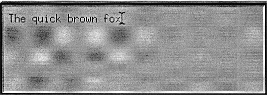
A Text component should be used to display and enter text. A Text component must be composed of an area for displaying and entering text. The text can be either a single line or multiple lines. Text must support the range selection model as described in Chapter 4, "Selection" and can support the discontiguous selection model.
The following text describes the navigation actions of this component:
| <Up arrow> | In multiline Text components, <Up arrow> must move the location cursor up one line. In single-line Text components, <Up arrow> must navigate upward to the previous component if the Text component is designed to act like a basic control. | |
| <Down arrow> |
| |
| <Left arrow> |
| |
| <Right arrow> | | |
| <PageUp> | In multiline Text components, <PageUp> must move the location cursor up one page. | |
| <PageDown> | In multiline Text components, <PageDown> must move the location cursor down one page. | |
| <PageLeft> or <Ctrl> <PageUp> | | |
| <PageRight> or <Ctrl> <PageDown> |
| |
| <Ctrl> <Right arrow> | | |
| <Ctrl> <Left arrow> | | |
| <Ctrl> <Down arrow> | | |
| <Ctrl> <Up arrow> | | |
| <Begin> | In a Text component used generally to hold multiple words, must move the location cursor to the beginning of the line. | |
| <End> | In a Text component used generally to hold multiple words, must move the location cursor to the end of the line. | |
| <Ctrl> <Begin> | | |
| <Ctrl> <End> |
|
The following text describes the operations of this component:
| <Space> or <Shift> <Space> | | |
| <Return> | In multiline Text components, <Return> must insert a carriage return. | |
| <Ctrl> <Return> and <Enter> | | |
| <Tab> and <Shift> <Tab> | must be used to move to the previous field if <Tab> is used to move to the next field. Otherwise, <Shift> <Tab> should be used for tabbing backward. If <Shift> <Tab> is used for tabbing backward and the location cursor is at the beginning of the text, <Shift> <Tab> can optionally move to the previous field. Modifying <Tab> or <Shift> <Tab> with <Ctrl> must evoke the same field navigation function as <Tab> or <Shift> <Tab>. | |
| <BackSpace> | When the selection is empty or when the component is in add mode with the cursor disjoint from the selection, <BackSpace> must delete one character backward. Otherwise, <BackSpace> must delete the selection. | |
| <Delete> | When the selection is empty or when the component is in add mode with the cursor disjoint from the selection, <Delete> must delete one character forward. Otherwise, <Delete> must delete the selection. | |
| <Ctrl> <Delete> | | |
| <Insert> | If the Text component supports replace mode, must toggle between insert mode and replace mode. By default, Text components must start in insert mode, where the location cursor is between two characters. In insert mode, typing a character must insert the character at the position of the location cursor. Text components can also implement replace mode, where the location cursor is on a character. In replace mode, typing a character must replace the current character with that newly entered character and move the location cursor to the next character, selecting it. Many of the requirements for a text-like collection in this guide assume that the collection is in insert mode and do not apply in replace mode. | |
| BSelect Click 2+ | | |
| BSelect Motion 2+ | | |
| <Shift> BSelect Click 2+ | | |
| <Shift> BSelect Motion 2+ | | |
| <Ctrl> BSelect Click 2+ | | |
| <Ctrl> BSelect Motion 2+ | | |
| <Help> | Must provide any available help for the Text control. |
For more information on Text selection, see the description of the selection models in Chapter 4, "Selection."
A ToggleButton should be used to select options in an application. When the choice is one of many, the ToggleButton is called a RadioButton. When the choice is any of many, the ToggleButton is called a CheckButton. The ToggleButton must be composed of a text or graphic label, and it can contain a graphic that indicates the state of the ToggleButton. The graphic should precede the label and should have two distinctive states that indicate the set and unset states of the ToggleButton.
For a description of the activation of the two types of ToggleButtons, see the reference pages in Section 9.7, "CheckButton" andSection 9.48, "RadioButton."
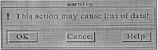
A WarningDialog should be used to alert the user to a possible danger. It should interrupt the user's interaction with the application. It should contain a warning symbol, a message, and one of the following button arrangements:
Yes No Yes No Help OK Cancel OK Cancel Help |
For more information, see the reference page in Section 9.12, "DialogBox."
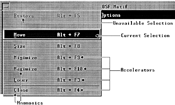
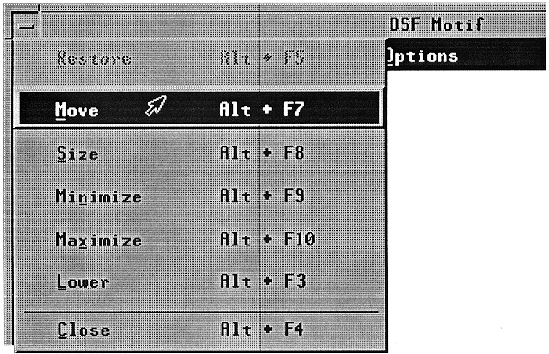
The window Menu, sometimes called the system Menu, is used to display the list of window actions. All actions possible for a window should be displayed in the window Menu, since keyboard-only users interact with the window manager through this Menu.
The window Menu button must be located in the upper-left corner of the window. Double-clicking the window Menu button must close the window. Pressing <Shift> <Escape> or <Alt> <Space> must activate the window Menu button for the window with the focus. The illustration on this reference page shows a posted window Menu.
A primary window Menu must have the following selections in the order listed:
A secondary window Menu must have the following selections in the order listed: Move, Size, and Close. A secondary window Menu can include Restore above Move, Maximize below Size, and Lower above Close, but the lower option on a secondary window lowers all the windows secondary to that window's primary window. A secondary window Menu should not include Restore if it does not include Maximize. A secondary window must not include an entry for Minimize.
A secondary window resulting from a Menu being torn off must have the following entries in the order listed: Move, Lower, and Close. It must not include entries for Restore, Size, Minimize, or Maximize.
See Chapter 7, "Window Manager Design Principles" for more information on the window Menu and the window manager in general. See Chapter 6, "Application Design Principles" for information about Menu design.
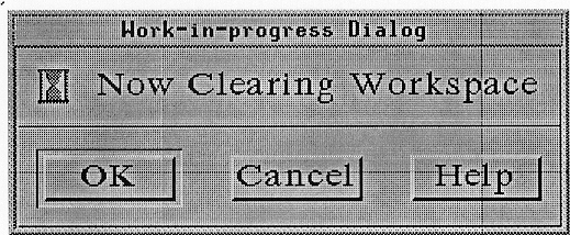
A WorkingDialog should be used to show work in progress and give the user an opportunity to cancel the operation. It should not interrupt the user's interaction with the application. It should contain a working symbol, a message, and one of the following button arrangements:
OK Cancel OK Cancel Help |
For more information, see the reference page in Section 9.12, "DialogBox."